Understanding Color Theory for Cross-Stitch
Understanding Color Theory for Cross-Stitch
Color is what brings a cross-stitch pattern to life. Understanding basic color theory can help you choose better palettes, substitute threads confidently, and even design your own patterns. Let’s explore how color works in the context of cross-stitch.
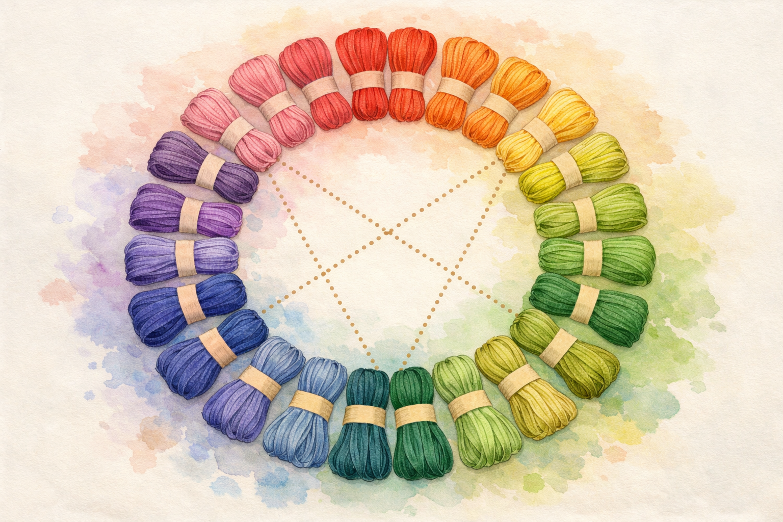
The Color Wheel Basics
The color wheel is your best friend when working with thread colors. It organizes colors in a circle based on their relationships:
- Primary colors: Red, blue, and yellow. These can’t be mixed from other colors.
- Secondary colors: Green, orange, and purple. Made by mixing two primaries.
- Tertiary colors: The six colors made by mixing a primary with an adjacent secondary (like red-orange or blue-green).
Color Relationships That Work
Complementary Colors
Colors that sit directly opposite each other on the color wheel create vibrant, eye-catching contrast. Think blue and orange, red and green, or yellow and purple.
In cross-stitch, complementary colors make designs pop. A bouquet of red flowers (DMC 321, 498) on green stems (DMC 699, 702) looks striking because red and green are natural complements.
Note
Analogous Colors
These are colors that sit next to each other on the wheel, like blue, blue-green, and green. Analogous palettes create harmonious, soothing designs.
For a serene ocean scene, you might use DMC 3755 (baby blue), 519 (sky blue), 518 (light wedgewood), and 3808 (ultra dark turquoise). The colors flow naturally because they’re neighbors on the wheel.
Monochromatic Schemes
Using different shades and tints of a single color creates elegant, sophisticated pieces. DMC organizes many of their threads in color families that make monochromatic stitching easy:
- Blue family: DMC 3756 (ultra pale) through 823 (dark navy)
- Pink family: DMC 818 (baby pink) through 150 (dusty rose ultra dark)
- Green family: DMC 369 (very light pistachio) through 890 (ultra dark pistachio green)
Color Harmony Explorer
Click on the color wheel to pick a hue, then see DMC thread matches for each harmony.
Selected: #E61919
Complementary
DMC 666 + DMC 958
Analogous
DMC 602 + DMC 666 + DMC 721
Triadic
DMC 666 + DMC 702 + DMC 797
Split-Complementary
DMC 666 + DMC 958 + DMC 798
Understanding DMC Thread Families
DMC numbers aren’t sequential by color, which can be confusing at first. Here are some helpful groupings:
Warm Colors
- Reds: 304, 321, 498, 815, 816 (from bright to dark)
- Oranges: 720, 721, 722, 740, 741, 742
- Yellows: 307, 444, 726, 727, 973
Cool Colors
- Blues: 322, 334, 517, 518, 519, 797, 798, 799
- Greens: 319, 367, 368, 369, 699, 700, 702, 703
- Purples: 208, 209, 210, 211, 327, 552, 553, 554
Neutrals
- Browns: 433, 434, 435, 436, 437, 801, 898
- Grays: 317, 318, 414, 415, 762
- Black/White: 310 (black), B5200 (bright white), BLANC (white), ECRU
Choosing a Color Palette
Start with Your Focal Point
Every design has a star. If you’re stitching a floral pattern, the flowers are your focus. Choose their colors first, then build the supporting palette around them.
Info
Use the 60-30-10 Rule
A balanced design typically uses:
- 60% dominant color (usually background or the largest area)
- 30% secondary color (supporting elements)
- 10% accent color (small pops that draw the eye)
Consider Value and Contrast
Value refers to how light or dark a color is. Good cross-stitch patterns have a range of values that create depth and dimension. If all your colors are the same value (even if different hues), the design can look flat and muddy.
Test your values: Take a photo of your thread selection and convert it to black and white. Can you see distinct differences between the threads? If they all blend into the same gray, you need more contrast.
Account for Fabric Color
Your fabric color affects how every thread looks. A color on white Aida will appear different on cream, and dramatically different on black or navy fabric. Consider:
- On dark fabric, light and bright colors pop while darks may disappear.
- On light fabric, medium to dark colors show best while very pale threads can wash out.
- Cream or natural fabric warms up all colors slightly.
Substituting Colors
Sometimes you can’t find the exact DMC color a pattern calls for, or you want to customize. Here’s how to substitute successfully:
- Match the value first: A substitute should be the same lightness/darkness as the original.
- Stay in the same color family: Replacing a warm red with a cool red will shift the entire feel.
- Check adjacent stitches: Make sure your substitute still contrasts well with neighboring colors in the pattern.
- Use DMC’s conversion charts: If switching between brands (DMC, Anchor, Weeks Dye Works), use official conversion charts as a starting point.
Blending Threads for Custom Colors
One of cross-stitch’s secret weapons is thread blending — combining strands of different colors in your needle to create custom shades that don’t exist in any thread line.
How to Blend
Since most stitching on 14-count Aida uses 2 strands, simply use 1 strand of each color:
- Separate one strand of Color A and one strand of Color B.
- Thread both through your needle together.
- Stitch as normal.
The result is a subtle, heathered effect that blends the two colors visually. This technique is wonderful for:
- Smooth gradients: Blend adjacent shades to create seamless transitions between colors (e.g., 1 strand DMC 799 + 1 strand DMC 809 creates a shade between the two)
- Realistic textures: Blend browns and greens for natural-looking foliage, or blues and grays for realistic stone
- Skin tones: Many experienced stitchers blend flesh tones to create more natural, less flat-looking skin
Thread Blending Preview
Choose two DMC thread colors to see how they look when blended with alternating stitches.
Alternating Stitch Pattern
16x16 alternating grid
Perceived Blend
Tips for Blending
- Test blended colors on scrap fabric before committing to your project
- Keep notes on which combinations you used — you’ll want to replicate successful blends
- Blended stitches look slightly different from solid stitches, which adds visual interest and depth
Working with Specialty Threads
Beyond standard DMC cotton floss, there’s a whole world of specialty threads that can elevate your projects:
Variegated Threads
These threads gradually shift between colors along their length. DMC’s Color Variations line and Weeks Dye Works are popular options. Variegated threads create a painterly, watercolor effect without any extra effort.
Tips for variegated threads:
- Stitch each cross completely before moving to the next (rather than stitching a row of half-stitches). This preserves the color variation pattern.
- Cut shorter lengths to get more variation within a small area, or longer lengths for more gradual transitions.
- They work best for organic subjects like flowers, water, sky, and foliage.
Overdyed Threads
Similar to variegated but with more dramatic color changes, overdyed threads (from brands like Weeks Dye Works and Classic Colorworks) are hand-dyed, meaning every skein is slightly unique. They add beautiful character to projects, especially samplers and folk art designs.
Metallic Threads
DMC Light Effects and Kreinik threads add shimmer and sparkle. They’re trickier to work with — use shorter lengths and a larger needle, and consider using a thread conditioner like Thread Heaven to reduce tangling.
Tip
Swatch Testing: Your Secret Weapon
Before committing thread choices to a large project, create a small color test swatch:
- Cut a small piece of your project fabric (or the same type and color).
- Stitch a small block (5x5 stitches is plenty) of each color you plan to use, placing them adjacent to how they’ll appear in your design.
- View under different lighting: Colors look dramatically different under daylight vs. incandescent vs. fluorescent light. Check your swatch under the lighting where you’ll display the finished piece.
- Step back: Hold your swatch at arm’s length. Do the colors have enough contrast? Do similar shades blend together or remain distinct?
Swatch testing takes 30 minutes but can save you from discovering a poor color choice dozens of hours into a project. It’s especially important when substituting colors or working with a custom palette.
Building Confidence with Color
The best way to develop your color sense is to experiment. Create small samplers trying different combinations. Study finished pieces you admire and identify what color relationships the designer used. Over time, you’ll develop an intuitive feel for what works.
Want to experiment with color harmonies hands-on? Try our Color Theory Tools to find complementary DMC colors and build palettes. You can also see how your colors will look on different fabrics using the Fabric Preview tool on any pattern page.
If you’re just getting started, check out our complete beginner’s guide for everything you need to know about supplies and technique.
Remember: there are no absolute rules in art. Color theory provides guidelines, but the most important thing is that you enjoy the colors you’re working with. After all, you’ll be spending many happy hours stitching with them!
More Articles
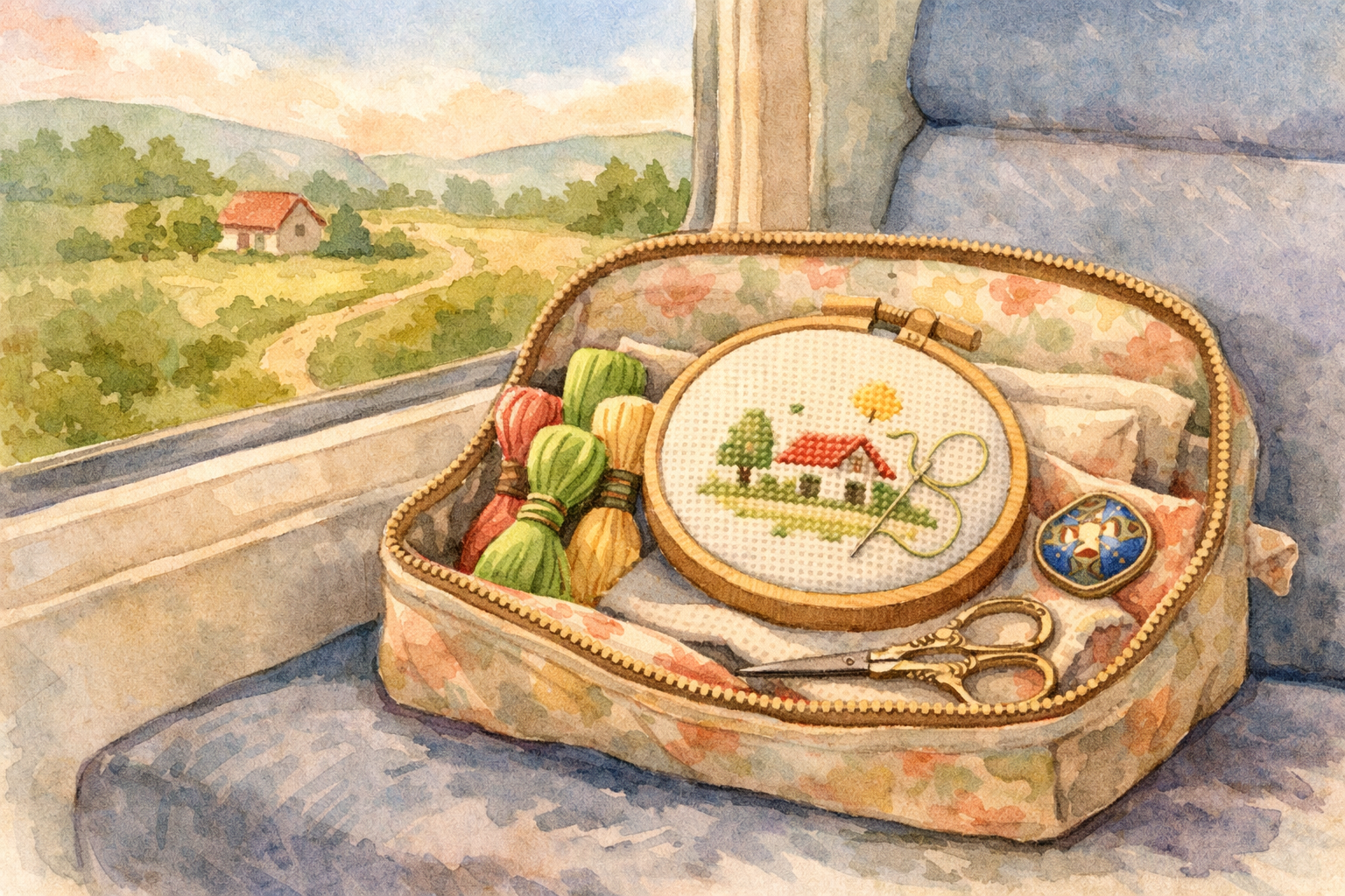
Traveling with Your Cross-Stitch Projects
Cross-stitch is the perfect portable craft. Learn how to pack your projects for travel, navigate airport security, and keep stitching wherever you go.
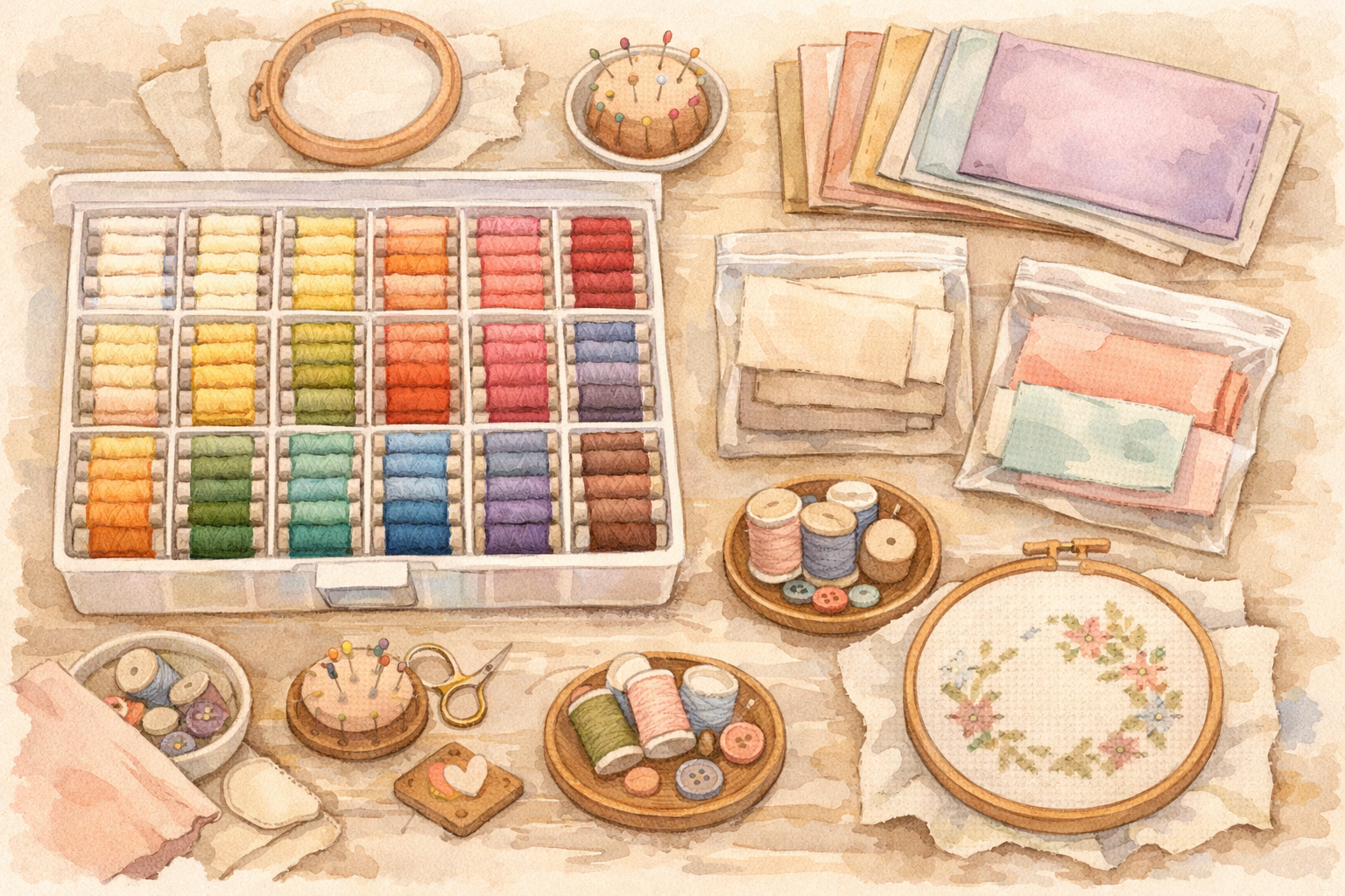
Organizing Your Cross-Stitch Stash
Fabric, floss, patterns, tools — your cross-stitch collection grows fast. Practical storage and organization strategies to keep your stash tidy and accessible.
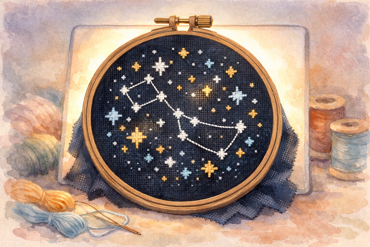
Stitching on Dark and Colored Fabrics
Dark and colored fabrics create stunning effects but come with unique challenges. Master the techniques for working with black, navy, and colored Aida and evenweave.